XOR effect in CSS
XOR, or exclusive or is a logical operator that returns true only if exactly one of the two inputs is true. Mathematically speaking:
Let's implement a CSS effect based on this. In the end, we should achieve something like this:
If you want to jump straight to the code, the source code for this post is available on GitHub: CSS Playground - XOR demo.
Preparation
First, let's prepare some base structure we will use to build the effect. Let's start with simple HTML
Note that I am using JSX and React, but you can of course use plain HTML with small adjustments, like replacing className with a class.
<div className="container">
  <div className="box"></div>
  <div className="text">XOR</div>
</div>
Elements .box and .text will be the ones to which we will apply XOR effect. Now, let's create simple styles for them.
.container {
  width: 1200px;
  height: 800px;
  border: 1px dashed #aeaeb3;
  display: flex;
  align-items: center;
  justify-content: center;
}

.box {
  width: 300px;
  height: 200px;
  background-color: black;
}

.text {
  color: black;
  font-size: 96px;
  font-weight: bold;
}
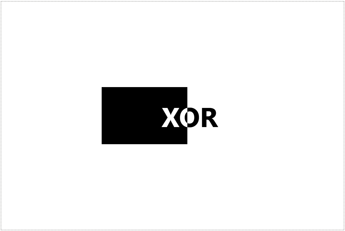
We should achieve something like this:
Let's move the text a little bit to the left, to overlap with our box. This will allow us to later demonstrate XOR effect. Add transform to the text:
.text {
  /* ... */
  transform: translate(-90px);
}
We should now see that the text and the box overlap.

Now, when we have our base prepared, let's blend!
Blend modes
In computer graphics, blend modes are used to determine how two layers are blended. The default behavior is that the higher layer covers whatever is present on the lower layer. There are however different blend modes that can be used. For a nice overview of these modes, take a look at the Blend modes Wikipedia page.
Today, we are especially interested in the "difference" blend mode. The difference blend mode takes the difference value of each pixel, inverting light colors. It subtracts either the blend color from the base color or the base color from the blend color, depending on which has the greater brightness value. If the color values are identical, they become black.
Fortunately for us, CSS provides us with an implementation of blend modes in the form of mix-blend-mode property. As MDN states:
The
mix-blend-modeCSS property sets how an element's content should blend with the content of the element's parent and the element's background.
So, in our case, we will use mix-blend-mode: difference property to achieve our result. Let's add it to our .text styles.
.text {
  /* ... */
  mix-blend-mode: difference;
}
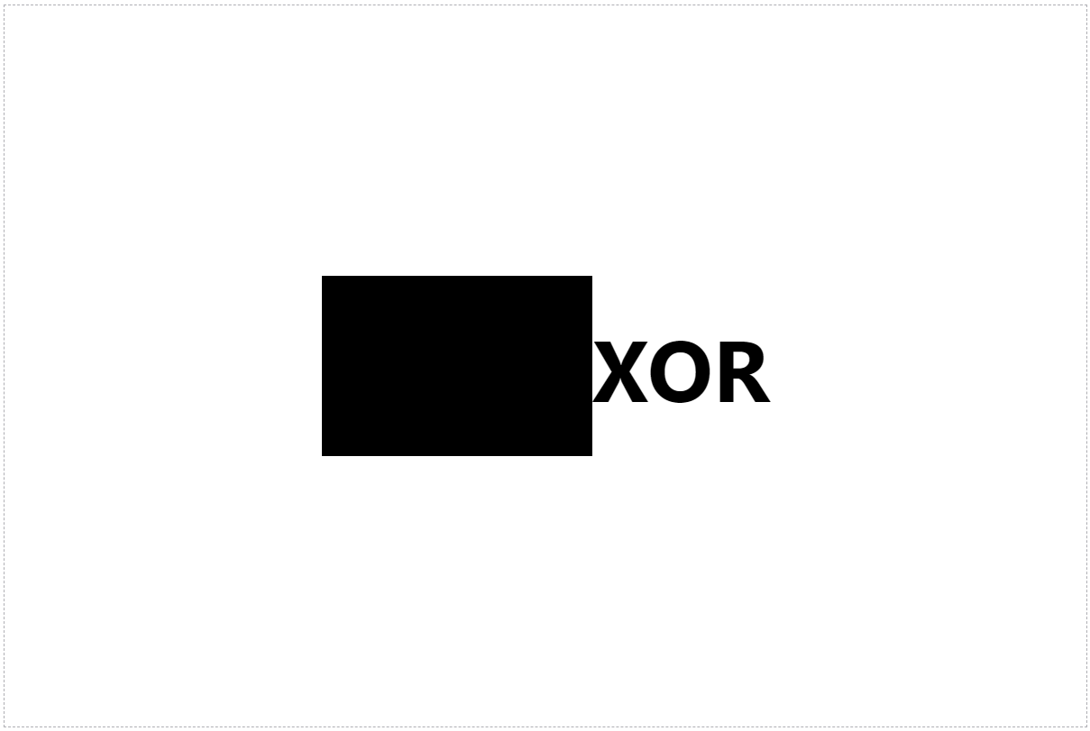
As we can see, nothing really changed. Why? As stated previously
If the color values are identical, they become black
So in our case, two black values for both .box background-color and .text color result in the same, black value. Let's now change them both to white to see the result.
.box {
  /* ... */
  background-color: white;
}

.text {
  color: white;
  /* ... */
}
Now we can definitely see some result!
Again, the result is black, as we mix two identical colors. What will happen in case we select a different color? Let's try it out. I've decided to mix colors #374151 and #ea580c.

Now we can definitely see this blend mode in action! But, for our demo, let's go back to white as a value of both attributes to achieve the final result.
Inverting
We now have our XOR effect in action, but it's not so impressive, as we cannot really see the box.
What can we do to achieve the result we want? Let's use another really useful CSS feature called filter. As MDN states:
The
filterCSS property applies graphical effects like blur or color shift to an element.
In our case, we want to invert the color to achieve white text over the black box. And this is exactly what we are going to use - the invert() function.
The
invert()CSS function inverts the color samples in the input image.
So, let's add it to our .container styles, to invert colors inside of it:
.container {
  /* ... */
  filter: invert(100%);
}
Now, we should see our desired effect.
The complete code looks like this:
.container {
  width: 1200px;
  height: 800px;
  border: 1px dashed #aeaeb3;
  display: flex;
  align-items: center;
  justify-content: center;
  filter: invert(100%);
}

.box {
  width: 300px;
  height: 200px;
  background-color: white;
}

.text {
  color: white;
  font-size: 96px;
  font-weight: bold;
  transform: translate(-90px);
  mix-blend-mode: difference;
}
Most of the properties above are just for demo purposes to show the result of our experiment in a nice way. You may want to create some different styles in your case, and keep only important parts that we talked about.
You can find the source code for this demo on my GitHub.